Signs are but one “visual aspect” affected by the new branding; others include consumer communications, websites, office designs and retail stores.
From the perspective of “mouth feel,” as they call it in the confectionery business, I prefer Hugs to Kisses.
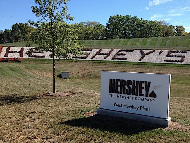
But the Hershey’s Kiss is iconic, whether in its silver wrapper, on a street light in its namesake hometown, or as the standard bearer for The Hershey Co.
On Aug. 29, the company unveiled an updated corporate brand that, according to a news release, “builds on the company’s powerful legacy and creates a new, modern look and feel that positions the company for the next 100 years.”
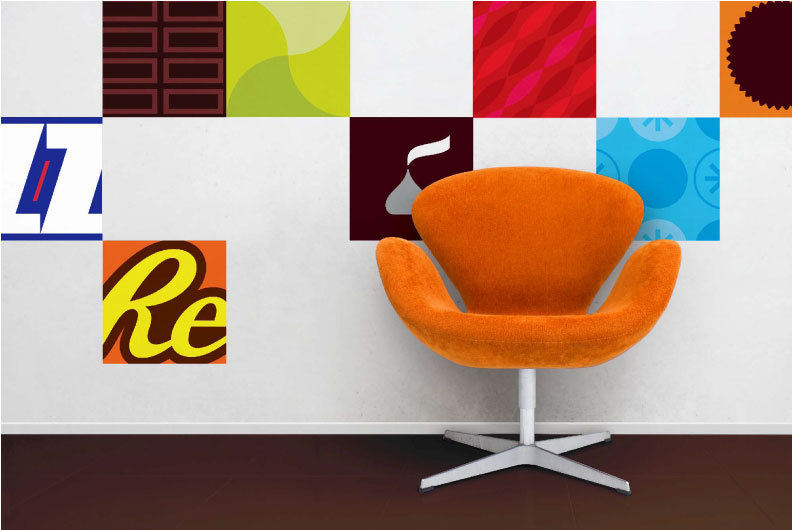
That’s ambitious, considering that the new company logo replaced once that debuted only in 2005, when Hershey Foods became The Hershey Co. The new logo “is a modern update that features a new interpretation of the iconic shape of its Kisses brand chocolate.” (Here’s an analysis of the remake, including before and after images of the logo.)
Logo beginning of the costs
The company has more than 80 brands (Reese’s, Jolly Rancher and Ice Breakers among them) generating annual revenues of more than $7.1 billion.
Striking to me, neither the company’s news release nor any of the news coverage it sparked mentioned the cost to implement the new look.
Historically, the cost to develop logos has ranged widely, particularly when you compare start-ups to established brands. In 2008, Pepsi reportedly spent more than $1 million to make its logo “more dynamic and more alive,” according to a company executive.
Advertising Age noted that the logo was just the beginning of the costs.
“The real cost, said an expert, is in removing the old logo everywhere it appears and putting new material up. For Coke or Pepsi, when you add up all the trucks, vending machines, stadium signage, point-of-sale materials and more around the world, it could easily tally several hundred million dollars, the expert said.”
(It was the 11th logo in Pepsi’s history, the fifth in 21 years. Take a look at that 1898 Pepsi-Cola logo: It’s like something out of a Tim Burton movie, no? I love the script logo from 1951, identical to the one on the metal bottle opener on my porch, but I’m partial to the 1971 version as it was everywhere when I was growing up. I could see the local Pepsi bottler from my grandparents’ house in Auburn, Maine.)
Of course, the Hershey Co. logo is not in a league with the company’s consumer brands (the change only will be noted on the back of its products), much less with Coke or Pepsi. But there is a significant cost beyond just changing a logo, which is but a component of a brand.
Social media backlash
Again, from the Hershey Co. news release: “The new branding will impact all visual aspects of how The Hershey Company presents itself, from consumer communications to websites to the interior design of its office spaces and the look of its retail stores.”
That’s a lot of stuff to rebrand.
Clearly, this wasn’t a change made lightly or inexpensively.
There is a question as to how well the new logo was vetted, however, considering that a significant online population concluded that it resembled, as one put it, “just some blinking eyes away from being the poo emoji.”
And that certainly leaves a bad taste in one’s mouth.